Last year's design trends generated a lot of interest, so by popular demand, here are the Top Ten Design Trends for 2016!
THE Natural Hero
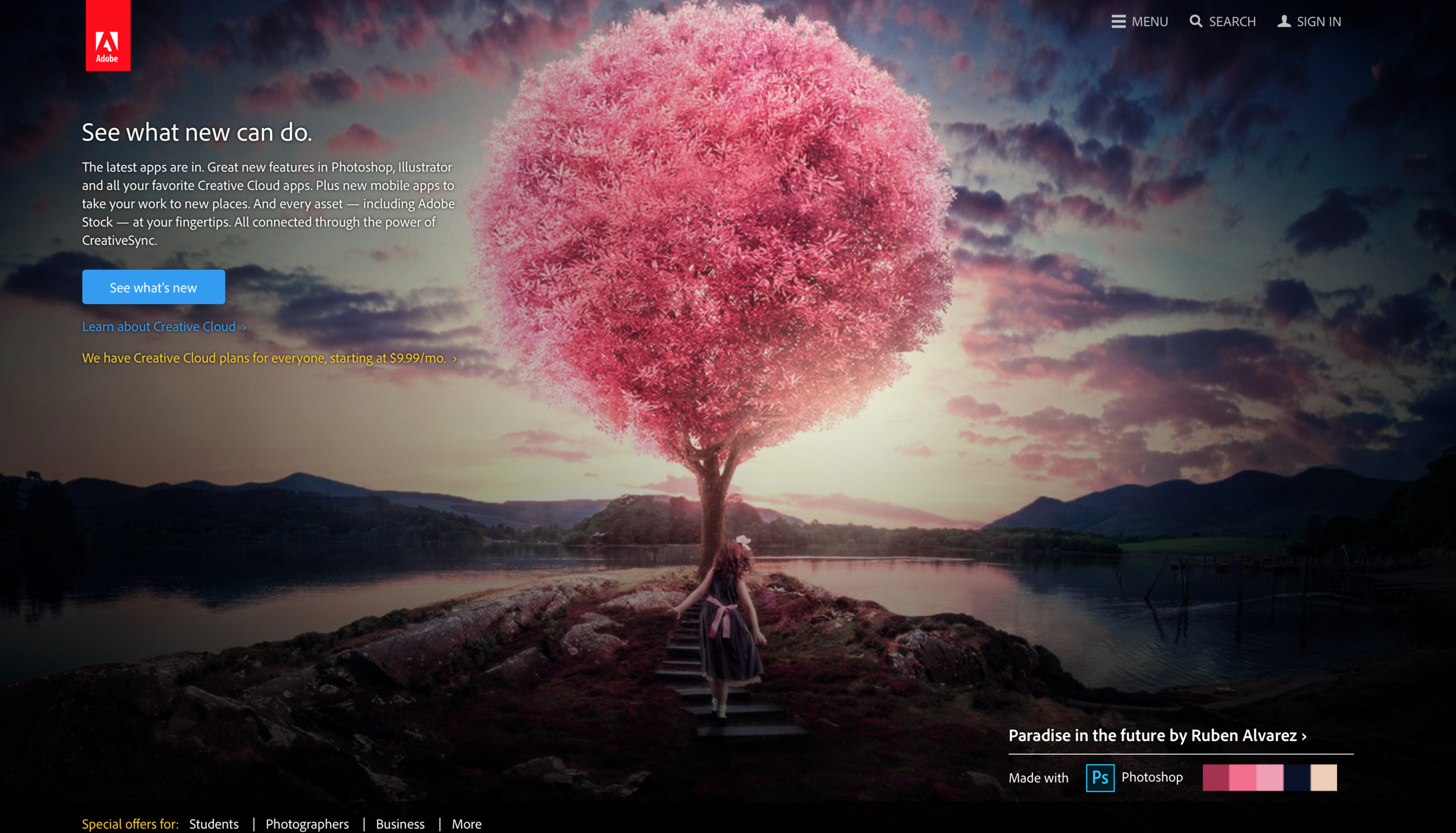
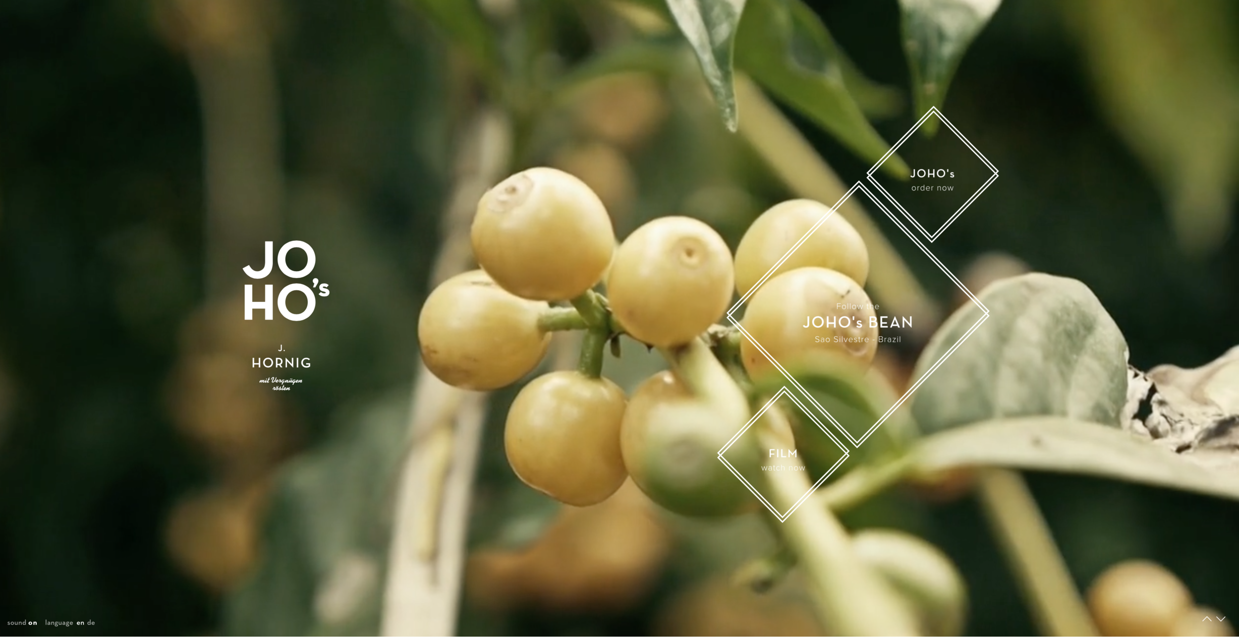
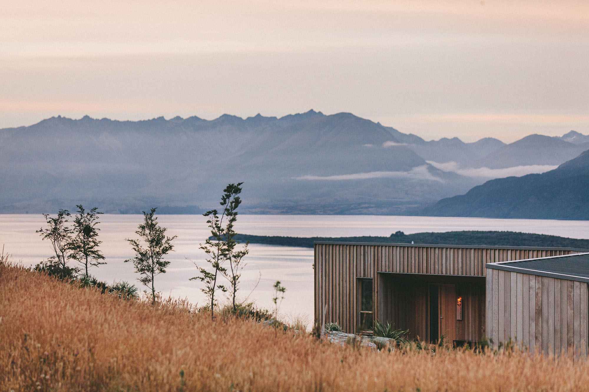
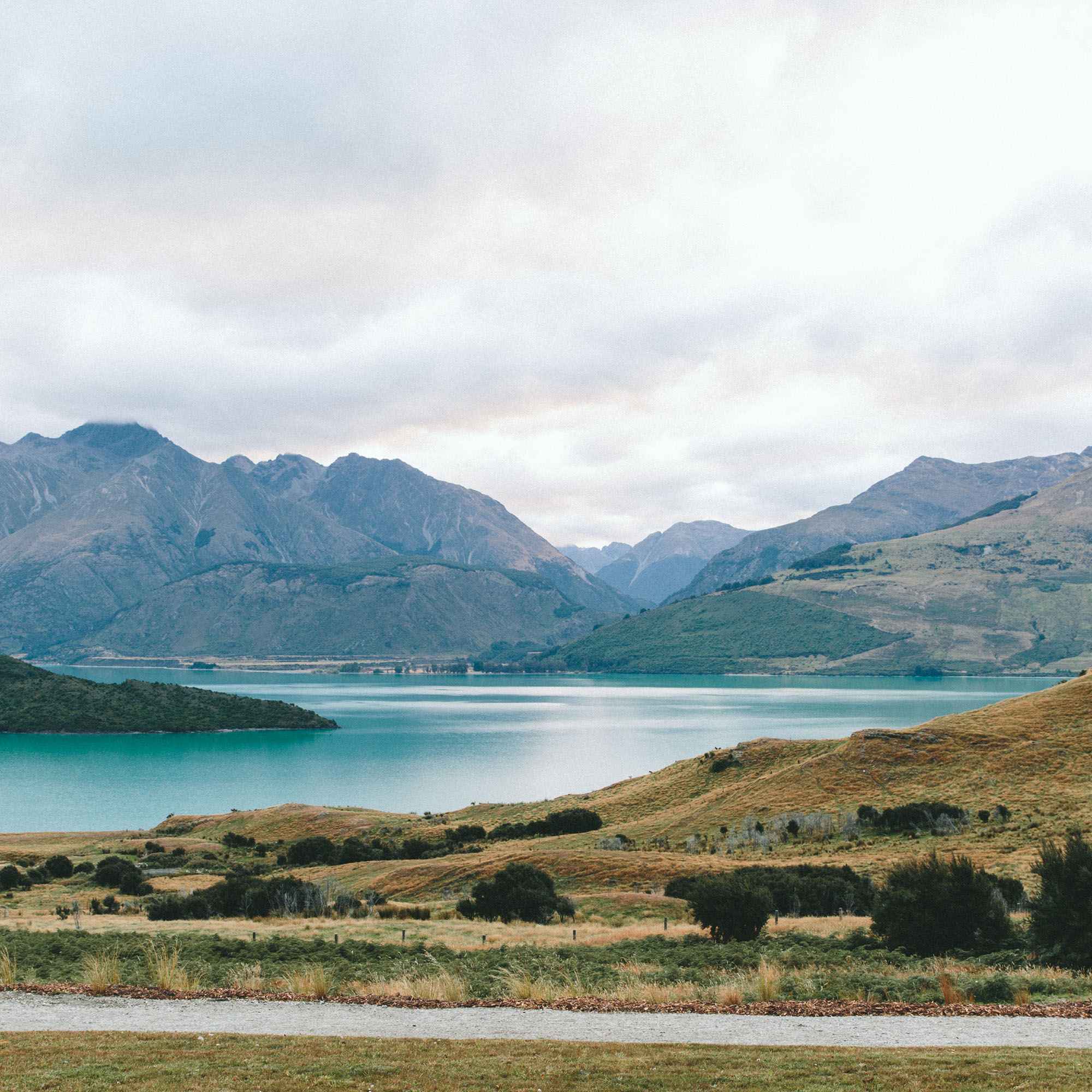
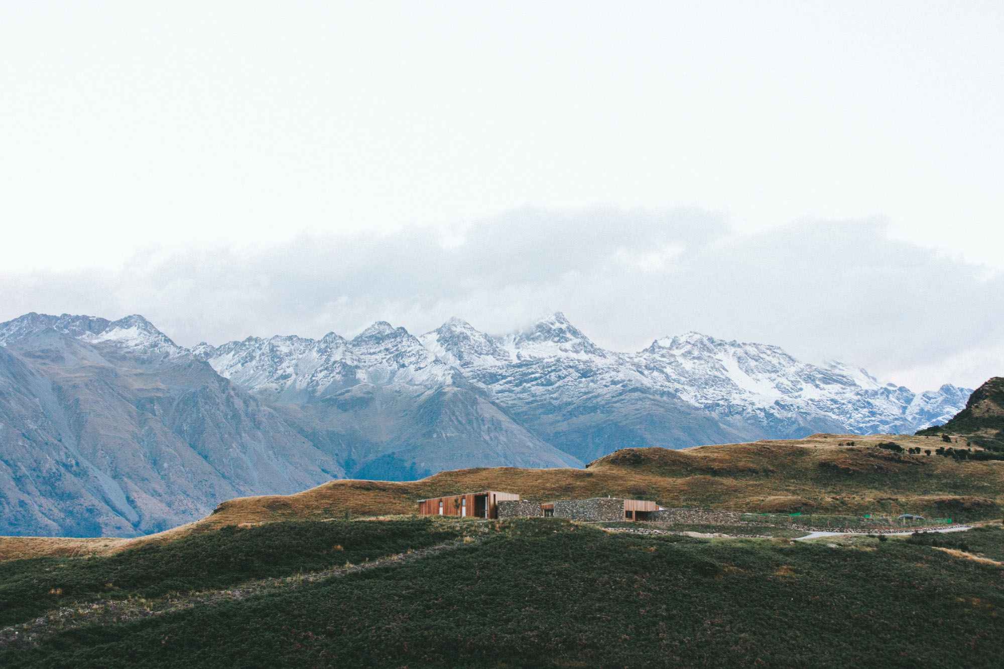
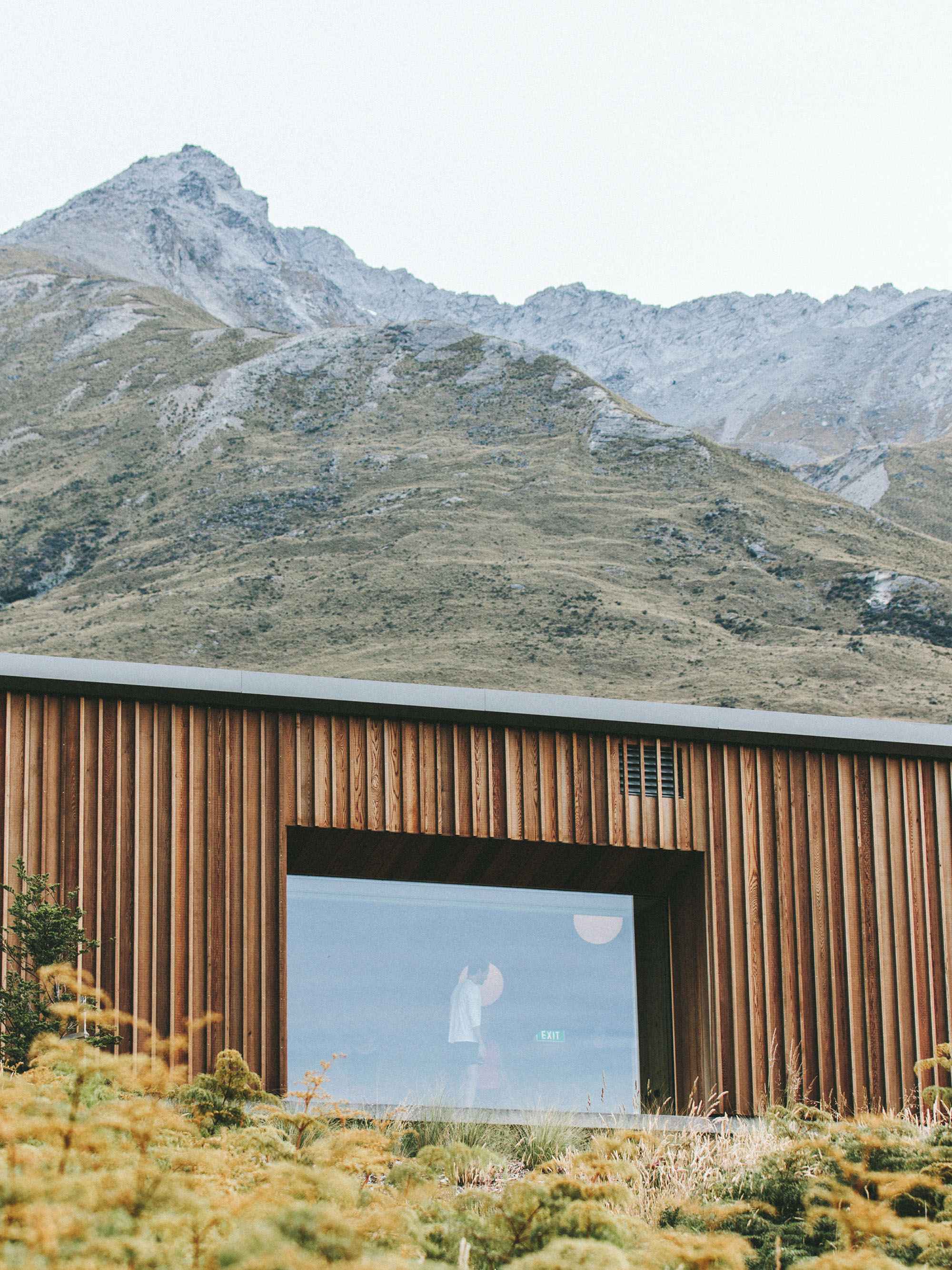
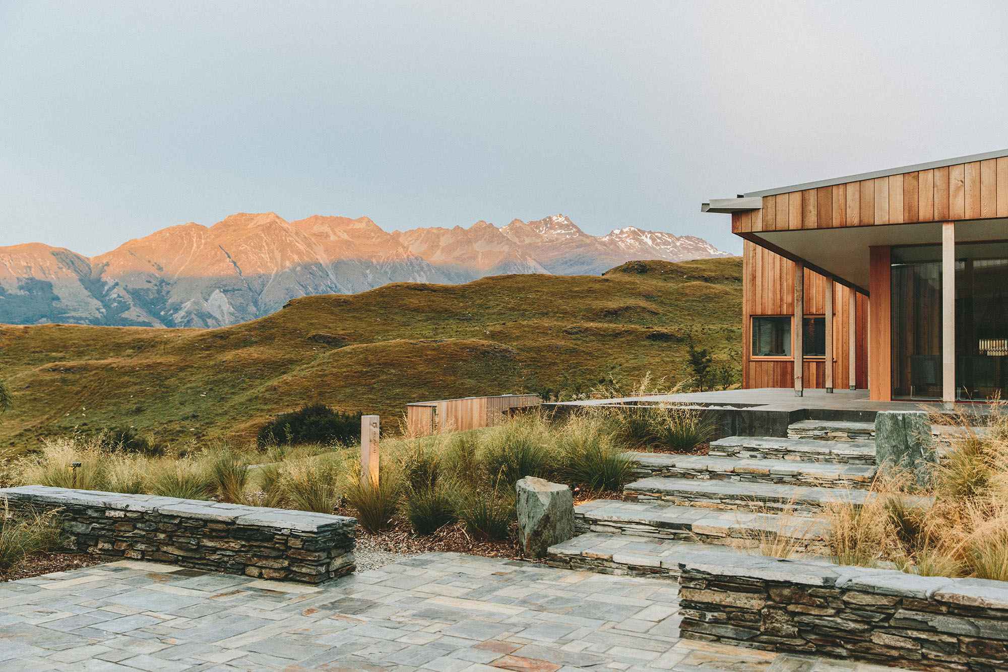
Previous years have seen trends go towards hand-drawn headers, animation, textures, architectural elements, and many more. But this year is the celebration of natural beauty, in the trend towards beautiful high-quality nature-theme photography headers.
It certainly makes sense, as I mention later, User Experience (UX) is essential this year, and nothing instills a positive mood better than nature. They appeal to our us in an essential way, and studies have proven that just a few minutes in nature improves our blood-pressure and our sense of wellbeing. In our increasingly artificial world, many of us are a little nature-deprived, thus making natural images all the more potent.
Airbnb
HERO IMAGES
Hero images* are nothing new, they've been climbing in prominence since last year's list.
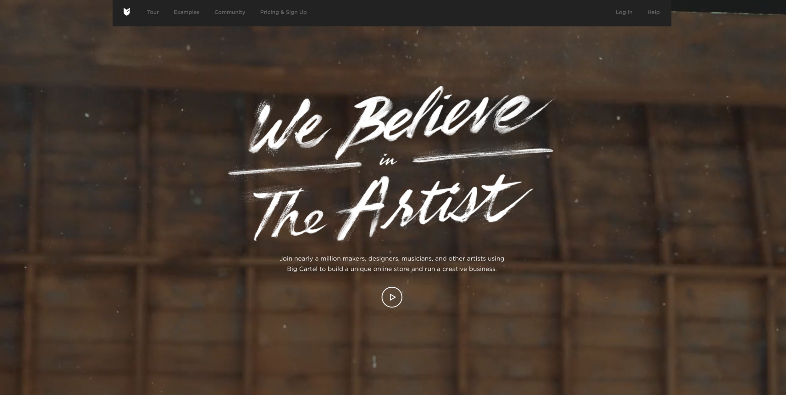
A hero image is a large banner image, prominently placed on a website, front and centre.[1][2]It is usually the first visual a visitor encounters on a website, and showcases the most important info.
But a wider access to high quality photography and ever-improving technology such as bandwidth speeds and compression) will only make them more prevalent. Now users can be treated with high quality images (and video!) without suffering.
"People are tired of cheesy looking stock photos and stock photo disruptors like Unlash, Stocksy and Death to the Stock Photo and Offset are providing a solution - natural looking stock photos that connect with people on a whole different emotional level. In 2016, we'll be seeing more amazing photos implemented in websites."(7)
#3 VIDEO VIDEO VIDEO
Video made my list last year, but I'm still surprised at the extent to which it seems to be popping up everywhere. Companies are really deciding to rely on high-internet speeds. When you think of the internet even just 15 years ago, a move to video as a website background is a BOLD move. Almost unbelievable.
#4 COLOR
One bold move in hand with another: colors are back more than ever.
Color is highly influential, communicating emotional energy and effecting how we perceive objects.
Color forecasts for spring trend distinctly bold:
instyleparis
"Color works because it’s straightforward and powerful."
Medium
We’re seeing more and more use of RGB color. RGB provides a much more saturated, rich way of presenting color that brands are really having fun with.
—Connie Birdsall(5)
Spotify
I think the biggest shift will be in the use of the color, where we’ll see more of a departure from the 60s era color palettes and evolve into the richer colors used in the last two decades of the 20th century.—Joel Kreutzer, head of design at Archrival(5)
#5 METALLICS
Metallics are spreading across design and fashion, and, this year, digital landscapes.
“The breakout star of 2016 is going to be metallics, and — given their ability to instantly bring a sophisticated and glamorous touch to any space — it’s not hard to see why. Whether adding a sleek touch with silver or chrome or warming a room with gold, rose gold or copper, every school of design can benefit from this trend.” (10)
Harpar's Bazaar
Metal does seem like an odd trend, because recreating them digitally is not as easily accomplished as other types of colour and texture trends. On the graphic end, it's hard to achieve a metal look well and very easy to go overboard and look tacky.
I predict you'll see metal twinkle in websites through photography and products and very slight touches of metallic illustration.
Apple.com - showcasing a mix of product photography and metallic illustrated elements.
What is unique about metals in late 2015 and 2016 is the mix: you'll see a variety of metals mixed together.
Squarespace.com, using video as a background with metallic objects.
#6 Rise of UX
UX is key to website success. Yet most of those in management roles have still never heard of UX. This year UX will make a leap, as the need for good UX is becoming clear across all types of websites.
"Startups and big business alike now view strong UX as a key differentiator. In 2016 expect to see increased demand for UX design from government and social services. While this complex work might be seen as less glamorous, the need is essential and the impact will be substantial. (8)"
If you've ever tried to navigate a government website, you'll be excited about this trend.
One type of UX we'll see more of is 'micro interactions':
"We' be seeing more of micro user experience (UX) in action. This trend will be disrupting industries where websites are not that fun to use like airlines, banks, health care, finances and more. Think of funny images, expressions, hidden functionality, smart personalized data and more.(7)"
At the same time, while UX finally travels into no-mans land, the nature of UX will be changing in 2016. No longer focused on playing with pixels, UX design will focus on more abstract elements:
Robust and comprehensive interaction design pattern libraries are gradually letting us focus our time on what really matters for the user: getting things done in an easy and familiar way. (14)
#7 Hamburger menus
Hamburger menus, you'll see these little guys in the upper corner of websites, usually paired with a hero image. They're all little bit of a wallflower, and as long as they become ubiquitous enough that a user knows to seek them out, they're generally a good idea. However, bring up hamburger menus and watch designers brawl.
Some warnings:
- If your site isn't designed well, then hamburger menus become a problem.(12) and
- There is a definitely age gap. Many in the generations before Millenials and Generation Y will have a hard time adapting to these.
- There are rumblings that the hamburger menu may become replaced by Apple's investment in 3D Touch (9b)
See the tiny three lines in the upper right corner?
#8 GEOMETRICS
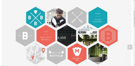
The current trend in geometry is a natural balance to the #1 trend, Natural photography. Recent trends in geometry have spilled into all forms of art and fashion.
"When it comes to adding visual interest to a room, there’s no easier way to make an impact than by adding a few geometric shapes. The recent interest in these shapely designs is a continuation of the ’70s-inspired trend that has been turning heads."(11)
Geometry in websites have been trending since 2013 (9) and this year, with geometry infiltrating fashion, we'll only see it more in websites looking to gain attention. (6)
#9 & #10 Minimalism & Ghost buttons (continued)
With advances in technology happening all the time, it can be an easy trap to try to fit every possible advancement all into one page. But it's the good designers job to pull a client a step or two back towards minimalism. As some fight for attention through a myriad of attention-grabbing methods, minimalism will continue to be the everlasting trend to balance out those urges. Minimalism is always in style, never tacky.
"Minimalism inspired a raft of sites that are clean, fast and easy-to-use." Minimalism will stick around as long as efficient, cost-effective websites are valued.
Minimalism also brings much needed breathing space to a website, known as "White space". White space is a key element in any design project, whether digital and traditional, and these days it's in short supply.
Ghost buttons return from last year as they continue to be trendy among websites with dark themes. This Haruki Murakami site is especially well-suited to using the Ghost Button.
In summary, the above are a list of ten design trends of 2016, but they are by no means exhaustive. There were many more topics that I couldn't cover, such as long scrolling, updates in responsive design and the other more technical aspects of web design, which I may cover in a another post.
So what do you think of this year's list? What trends do you think will dominate 2016?
Jessica Champagne is a graphic & web designer, author and communications expert who lives in beautiful Sooke, BC, Canada.
References
(1) Berman, M. G., Jonides, J., & Kaplan, S. (2008). The cognitive benefits of interacting with nature.Psychological Science, 19(12), 1207-1212.
(2) Bowler, D. E., Buyung-Ali, L. M., Knight, T. M., & Pullin, A. S. (2010). A systematic review of evidence for the added benefits to health of exposure to natural environments. BMC Public Health, 10, 456.
(3)https://en.wikipedia.org/wiki/Hero_image
(3b)http://line25.com/articles/30-web-designs-that-fully-embrace-the-hero-image
(4)http://www.awwwards.com/6-web-design-trends-you-must-know-for-2015-2016.html
(5) http://www.howdesign.com/resources-education/graphic-design-trends-2016/#sthash.omcroDKv.dpuf
(6)https://www.pinterest.com/annwu0114/geometric-trend-2016/
(7) http://www.forbes.com/sites/tomaslaurinavicius/2015/12/28/web-design-trends-2016/
(8) http://www.howdesign.com/resources-education/graphic-design-trends-2016/#sthash.omcroDKv.dpuf
(9) http://www.awwwards.com/50-awesome-websites-with-extraordinary-geometry-elements.html
(9b)http://thenextweb.com/opinion/2015/09/14/apples-plan-to-kill-the-hamburger-menu/
(10/11)freshome.com/2016-design-trends/
12)www.awwwards.com/be-careful-about-these-6-web-design-trends-in-2016.html
(13) http://www.howdesign.com/resources-education/graphic-design-trends-2016/#sthash.omcroDKv.dpuf
(14) http://uxdesign.cc/ux-trends-2015-2016/
