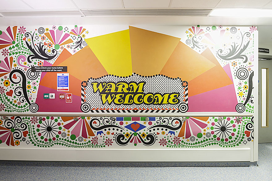
Traditionally hospitals are designed to be 'soothing', bland places. Faced with often a struggling budget (especially for public hospitals) they tend to err towards safe design, which is why it's so refreshing to see a change away from that.
My designer sister drew my attention to this children's hospital design on Facebook recently and I thought I should share it. Below are just a few photos from the London Royal Children's Hospital, a collaboration done by 15 artists. My favourite is, of course, by one of my favourite designers, Tord Boontje. Click the link below if you want to check out all the photos.
(Original url: http://www.boredpanda.com/artists-mural-design-royal-london-children-hospital-vital-arts/)
Design for special places and special people:
I have always thought the design of hospitals and sanctuaries to be an interesting challenge for interior designers and architects. One of my favourite examples comes from architect Alvar Aalto in the design of the Paimio Sanitorium, which he designed specifically with tuberculosis patients in mind and keeping in mind both the need for peace and quiet, sun, and the fact that patients would spend most of their time horizontally. (I would really need a separate post to truly do this topic justice). It is a great example of how design itself can be a tool for healing.
The importance of design in environments becomes more challenging when pain / stress / sickness is involved and even more important, in my opinion, when children are involved. I think that these design elements can play an important part in improving morale in hospitals not only for the patients but also for the workers.
One particularly important design element for children, I believe, is animals. I noticed that even in our local hospital (Victoria General) there are some small efforts to add animals and designs to the hospital for children. In the Emerg stall for children (separated slightly from most of the emergency stalls separated only by curtains) the stalls look similarly monotone and plain unless you take a second to look up. Instead of white on the ceiling there is a circular mini murals depicting turtles and orcas, an interesting balance of keeping the walls neutral ("peaceful"?), but the ceiling cheerful and distracting. Certainly this was thought by a smart interior designers that many patients will probably spend a lot of time in bed, and thus look upward at the ceiling.
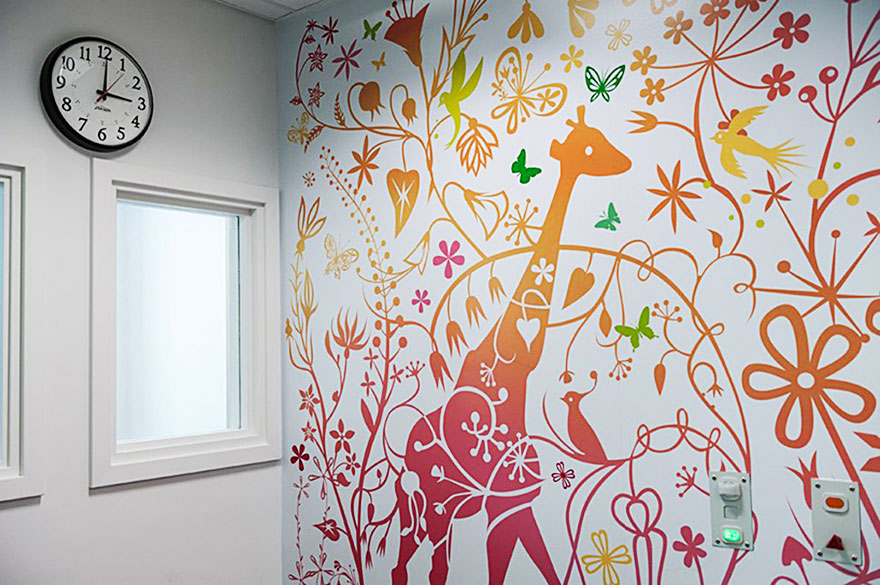
This photo below depicts are more flamboyant animal design in the children's wing of a hospital. Animals certainly help kids feel as if they are in a more loving, cheerful, soothing place, and anyone who has spent time around a child that may need to be distracted for a moment or two (for example, to put in an IV) can attest to the power of having a task for them to do, a green butterfly to find, for example.
“Alluding to renewal and growth, the work contains animals and elements in energising colours for children to find and discover. The larger drawings are very finely detailed and invite you to discover new elements day after day”
As a brief conclusion, I would love to see more examples of great design with patients, especially children, in mind, in local projects.


