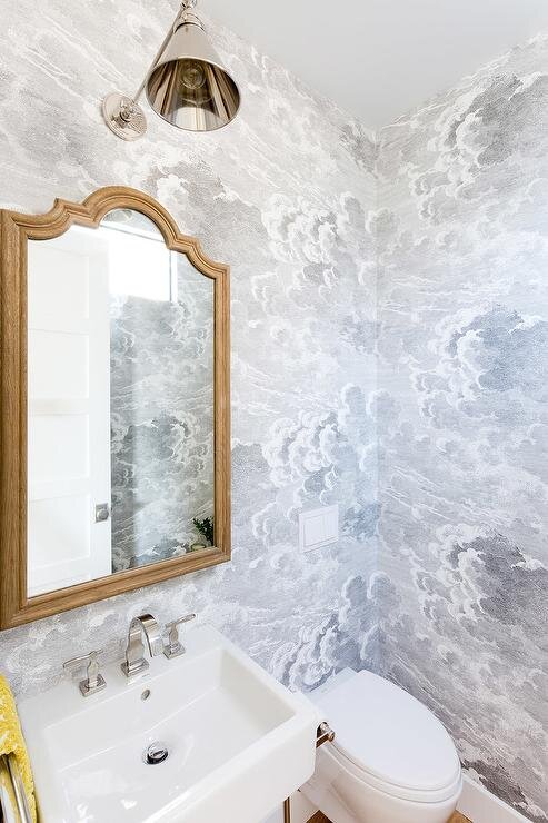
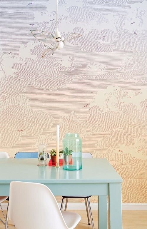
As I mentioned above, wallpaper is so much easier to get now. My jaw dropped this year when I saw the Scalamandre Zebra wallpaper available on Anthropologie (best known by me from Wes Anderson’s film The Royal Tenenbaums.) I love that wallpaper and couldn’t afford it nor was I fancy enough to have a personal interior design connection, it so I decided to HAND DRAW my version (white tigers) on the walls of a small room, with black artist pens. I learned very quickly things take a lot longer to draw than you think they will. Take how long you think and multiply by ten. Tigers have a lot of stripes, guys. You’ll understand why I reduced my ambitions very quickly. Now they are great wallpaper sites like Rifle Paper Co, etc, as well. You can even easily access photographic murals as well.
Downsides:
Though this design is forgiving, and I actually kept extra scraps to patch up anywhere as needed, my husband is incredibly against me putting up any picture frames, bed frames or causing any kind of holes. He was, after all, the one that helped do most of the work in terms of putting it up so I get it. That limits my ability to be creative a little though, for sure a downside.
Another downside is that sometimes having a mural can be limiting in terms of what you do in a space. You can’t really move it unless you’ve installed it on panels (something I thought about doing!) So if I decide I want my bed on that wall, I can do it, but there are limits. This may or may not be an issue for you depending on if you like to figure out one layout and stick to it. I tend to like to move things around a lot, but I also feel like sometimes being held down by a choice is good for me.
Color wise, this is a mostly neutral mural, but at the same time I felt like it did limit my color choices a little. For example, I didn’t like my ochre yellow chair with that mural. You can do it, some people pair yellow and gray/black, but its a CHOICE. It’s not subtle. Also orange was out, because Halloween. Again, you can do it, but it’s a choice. “Why did orange even come up?” you might think, well it’s because I was looking at orange and vermillion side tables and looking at layering warmth into my bedroom space, which has grown more feminine over time, more eclectic, a little warmer.
Recently I’ve had some sinus issues and have wondered if I’m allergic to dust mites, and have been taking out any clutter or fabrics I can from my bedroom, and I have to say I’m really grateful that my mural is an art element I can keep in there without worrying about dust mites.
Note: This post and the last one would make it seem that this couch has been living in my bedroom this whole time and it has not. It was usually downstairs. I’ve had my bed against this mural with a metal bed frame, I’ve had a mattress right on the floor and it still looked cool. I had a rowing machine in front of it and it looked cool, desk, etc. This room just happened to have looped in terms of design over 4 years.
Conclusion:
This mural was a great investment while I’m living in this house (and it’s been 5 years here.) I hate that I waited so long to get it. If I ever need to move, I can either keep it up, I think it’s neutral enough, or it is designed to come down easily. If that ever happens I’ll give you an update!
*Where’s the cat tax and dog tax Jess?! you’re saying, I get it! I’m working on it.
